
Challenge
JUJUHOME was born from a desire to create more than just a shop. It was always meant to be a feeling. A carefully curated lifestyle store in Hackney Wick, JUJUHOME needed a brand that could hold deep emotional resonance, reflect cultural nuance, and feel both personal and bold.
The challenge was clear. To build a full brand system that could carry sub-brands, collaborations, and both digital and physical presence. The brand had to be recognisable, scalable, and deeply human.
Approach
What emerged was a brand built on beautiful tensions. Care and fearlessness. Play and poise. Local roots and global resonance. We worked closely with the founders to shape a strategic foundation that could guide design, tone, and customer experience. From Hackney Wick creatives to international tastemakers, the brand needed to flex across cultures while remaining emotionally consistent.
We shaped four key audience personas, Each helped us define what JUJUHOME needed to offer emotionally and visually.
• The Urban Professional, juggling family life and design values
• The Creative Urbanite, grounded in Hackney’s cultural scene
• The Global Tastemaker, searching for originality and meaning
• The Thoughtful Gifter, seeking soul in every detail
Solution
1. Visual Identity
The logo system feels grounded and calm. The typography combines classic structure with softness in execution. It reflects a brand that is confident and kind.
2. Brand Messaging
We rooted the brand voice in the line:Thoughtfully Curated, Joyfully Lived.
The tone is warm and human. It feels personal, never performative. Confident but never pushy. Real words, short lines, spoken clearly. This voice shaped copy for packaging, signage, postcards, menus, social, and editorial. It also shaped the experience of shopping at JUJUHOME. Everything flows with intention.
3. Brand Architecture and Sub-Brands
As JUJUHOME grew, we helped create a flexible identity that could scale. Mini JUJUHOME, a playful edit of family-friendly goods, and JUJUHOME CHA, a tea-focused sub-brand, each needed their own presence.
We developed simple, ownable structures for each that felt unique but never separate. The parent brand remained a strong visual and tonal thread that ties them all together.
4. Community Touchpoints
We designed signage, postcards, menus, and packaging that invite rather than sell. Calls to action are never loud. They’re thoughtful and personal. The email strategy focused on quality and curation. No constant updates. Just thoughtful drops, real stories, and invitations to connect.
Conclusion
Studio EYC helped JUJUHOME become more than a store. We helped it become a living brand. A space for storytelling, for community, for meaningful design. One that celebrates the quiet beauty of everyday life, and invites people to live with care, joy, and individuality.Services
Brand Strategy, Creative Direction, Brand Identity, Graphic Design
Deliverables
Digital brand guidelines
Logo design
Colour palette
Typography system
Stationery set
A-board
Menu design
Message card
Packing tapes
Carrier bags
Postcards
Window display graphic
Year
2025
Client
JUJUHOME
Location
London, UK"Erica at Studio EYC is an incredible person to work with. They understand your needs, offer a wealth of professional and creative ideas, and support you through even the most challenging projects. Now, with a new identity, we are ready to attract ideal projects and partners. Audience response is positive — people pay attention. Our value is now simple and easy to understand. "
Na Di, Founder of JUJUHOME
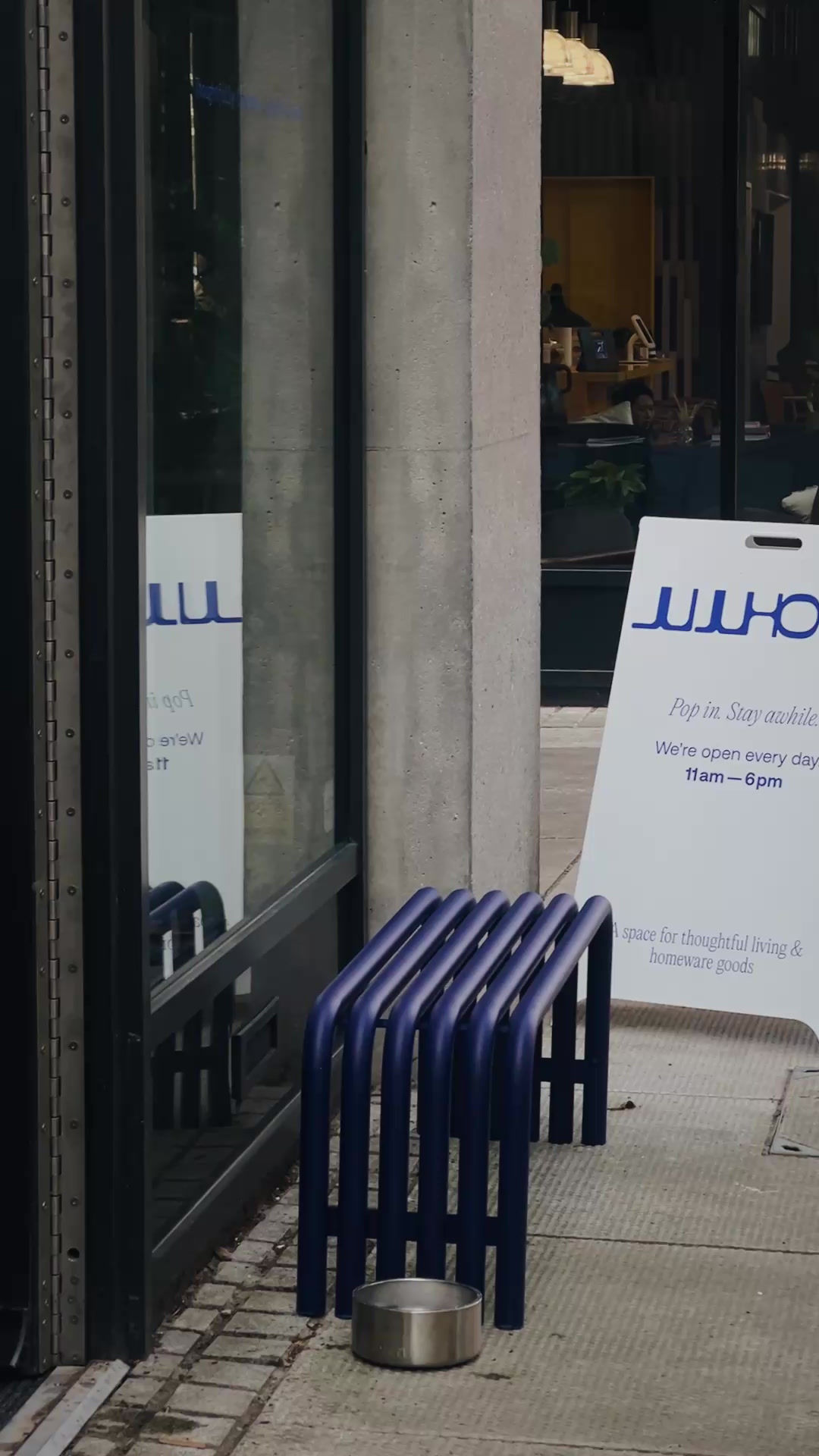


Logotype of JUJUHOME


A space for thoughtful living, expressed through fearless design.
Studio EYC created the full brand identity for JUJUHOME—a lifestyle and homeware store rooted in care, edge, and clarity. From logotype to colour palette, from tone of voice to spatial branding, every detail was shaped to reflect a brand that feels lived-in, local, and loved. Not just a store, but a story—told through calm, bold visuals and a cohesive experience.
Challenge
JUJUHOME was born from a desire to create more than just a shop. It was always meant to be a feeling. A carefully curated lifestyle store in Hackney Wick, JUJUHOME needed a brand that could hold deep emotional resonance, reflect cultural nuance, and feel both personal and bold.
The challenge was clear. To build a full brand system that could carry sub-brands, collaborations, and both digital and physical presence. The brand had to be recognisable, scalable, and deeply human.
Approach
What emerged was a brand built on beautiful tensions. Care and fearlessness. Play and poise. Local roots and global resonance. We worked closely with the founders to shape a strategic foundation that could guide design, tone, and customer experience. From Hackney Wick creatives to international tastemakers, the brand needed to flex across cultures while remaining emotionally consistent.
We shaped four key audience personas, Each helped us define what JUJUHOME needed to offer emotionally and visually.
• The Urban Professional, juggling family life and design values
• The Creative Urbanite, grounded in Hackney’s cultural scene
• The Global Tastemaker, searching for originality and meaning
• The Thoughtful Gifter, seeking soul in every detail
Solution
1. Visual Identity
The logo system feels grounded and calm. The typography combines classic structure with softness in execution. It reflects a brand that is confident and kind.
2. Brand Messaging
We rooted the brand voice in the line:Thoughtfully Curated, Joyfully Lived.
The tone is warm and human. It feels personal, never performative. Confident but never pushy. Real words, short lines, spoken clearly. This voice shaped copy for packaging, signage, postcards, menus, social, and editorial. It also shaped the experience of shopping at JUJUHOME. Everything flows with intention.
3. Brand Architecture and Sub-Brands
As JUJUHOME grew, we helped create a flexible identity that could scale. Mini JUJUHOME, a playful edit of family-friendly goods, and JUJUHOME CHA, a tea-focused sub-brand, each needed their own presence.
We developed simple, ownable structures for each that felt unique but never separate. The parent brand remained a strong visual and tonal thread that ties them all together.
4. Community Touchpoints
We designed signage, postcards, menus, and packaging that invite rather than sell. Calls to action are never loud. They’re thoughtful and personal. The email strategy focused on quality and curation. No constant updates. Just thoughtful drops, real stories, and invitations to connect.
Conclusion
Studio EYC helped JUJUHOME become more than a store. We helped it become a living brand. A space for storytelling, for community, for meaningful design. One that celebrates the quiet beauty of everyday life, and invites people to live with care, joy, and individuality.Services
Brand Strategy, Creative Direction, Brand Identity, Graphic Design
Deliverables
Digital brand guidelines
Logo design
Colour palette
Typography system
Stationery set
A-board
Menu design
Message card
Packing tapes
Carrier bags
Postcards
Window display graphic
Year
2025
Client
JUJUHOME
Location
London, UK"Erica at Studio EYC is an incredible person to work with. They understand your needs, offer a wealth of professional and creative ideas, and support you through even the most challenging projects. Now, with a new identity, we are ready to attract ideal projects and partners. Audience response is positive — people pay attention. Our value is now simple and easy to understand. "
Na Di, Founder of JUJUHOME